Web Design Trends for 2023: How to Stay Ahead of the Curve

The web is constantly evolving, and so are the design trends that shape it. Every year, new technologies, techniques, and styles emerge to create more engaging and immersive experiences for web users. As a web designer, you need to keep up with these changes and adapt your skills accordingly.

But how do you know which trends are worth following and which ones are just passing fads? How do you create websites that stand out from the crowd and meet the expectations of your clients and users? And how do you balance innovation with usability and accessibility?

In this article, we will explore five major web design trends that are expected to dominate in 2023. We will explain what they are, why they are important, and how you can implement them in your own projects. By the end of this article, you will have a better understanding of the current and future state of web design, and how you can use it to your advantage.

1. Nostalgia and the Y2K Aesthetic

One of the most noticeable web design trends for 2023 is the revival of nostalgia and the Y2K aesthetic. This trend is influenced by the cultural and social phenomena of the late 1990s and early 2000s, such as pop music, fashion, movies, video games, and internet culture.

The Y2K aesthetic is characterized by bright colours, geometric shapes, pixelated fonts and images, retro-futuristic elements, and custom cursors. It evokes a sense of nostalgia for a simpler and more optimistic time, as well as a playful and experimental attitude toward technology.

Some examples of websites that use the Y2K aesthetic are:

  • Christopher Nelson, a personal portfolio site that features sticker-like images, pixelated fonts, and a custom cursor.
  • Templeton Clothing is an online store that sells vintage clothing and accessories from the 90s and 00s.
  • Studio Brot is a creative agency that uses glitch effects, neon colours, and animated text to create a dynamic and futuristic look.

Design tip: To incorporate the Y2K aesthetic in your web design, you can use tools like Webflow or Elementor to create custom layouts, animations, and interactions. You can also use resources like Internet Archive or [Web Design Museum] to find inspiration from real websites from that era.

2. Artificial Intelligence

Another web design trend that is gaining momentum in 2023 is artificial intelligence (AI). AI is the ability of machines to perform tasks that normally require human intelligence, such as learning, reasoning, decision-making, and natural language processing.

AI can be used in web design to enhance user experience, optimize performance, generate content, and provide personalized recommendations. For example, AI can:

  • Analyze user behaviour and preferences to create tailored content and offers.
  • Use natural language processing to understand user queries and provide relevant answers.
  • Use machine learning to improve website speed, security, and accessibility.
  • Use generative design to create unique and original graphics, logos, and layouts.

Some examples of websites that use AI are:

  • [Grace], a nutritional product website that uses AI to create a near-touchable experience for users. It uses 3D models, animations, and sound effects to simulate the product’s texture, flavour, and benefits.
  • [Dribbble], a platform for designers to showcase their work and find inspiration. It uses AI to provide personalized recommendations based on user preferences, behaviour, and feedback.
  • [Copy.ai], a tool that uses AI to generate copy for various purposes. It uses natural language processing to understand user input and provide relevant suggestions.

Design tip: To use AI in your web design, you can use tools like [TensorFlow.js] or [Microsoft Azure Cognitive Services] to integrate AI features into your website. You can also use tools like [RunwayML] or [Artbreeder] to create generative designs using AI.

3. Hyper-Delights in a Website Journey

A website journey is the path that a user takes from landing on your website to completing a desired action. A hyper-delight is a moment of surprise or delight that enhances the user’s experience along the way.

Hyper-delights can be used in web design to create memorable impressions, increase engagement, build trust, and encourage conversions. They can take various forms, such as animations, illustrations, micro-interactions, sound effects, or gamification.

Some examples of websites that use hyper-delights are:

  • [Mailchimp], an email marketing platform that uses animations, illustrations, and humour to create a friendly and fun website journey. It also uses gamification to reward users for completing tasks and achieving goals.
  • [Stripe], a payment processing platform that uses micro-interactions, transitions, and sound effects to create a smooth and seamless website journey. It also uses animations and diagrams to explain complex concepts and features.
  • [Duolingo], a language learning app that uses gamification, sound effects, and feedback to create an engaging and motivating website journey. It also uses illustrations and characters to create a personalized and emotional connection with users.

Design tip: To create hyper-delights in your web design, you can use tools like [Lottie] or [SVGator] to create animations, [Figma] or [Sketch] to create illustrations, [Howler.js] or [Tone.js] to create sound effects, and [GreenSock] or [Anime.js] to create transitions and interactions.

4. Ecommerce – A Near-Touchable Experience

Ecommerce is the process of buying and selling goods or services online. In 2023, ecommerce is expected to grow even more, as more people shop online due to convenience, safety, and variety.

However, ecommerce also faces some challenges, such as the lack of physical interaction, the difficulty of conveying product quality, and the risk of fraud or dissatisfaction. To overcome these challenges, web designers need to create ecommerce websites that provide a near-touchable experience for users.

A near-touchable experience is an ecommerce website that simulates the sensory aspects of shopping in a physical store. It uses techniques such as 3D models, augmented reality, virtual reality, haptic feedback, and sound effects to make the products more realistic, interactive, and appealing.

Some examples of ecommerce websites that provide a near-touchable experience are:

  • [IKEA], a furniture retailer that uses augmented reality to let users see how their products would look in their own space. It also uses 3D models and animations to show product details and features.
  • [Nike], a sportswear brand that uses virtual reality to let users try on their products in different scenarios. It also uses haptic feedback and sound effects to simulate the product’s fit and performance.
  • [Gucci], a luxury fashion brand that uses 3D models and augmented reality to let users see how their products would look on themselves. It also uses sound effects and voice assistants to enhance the product’s appeal and functionality.

Design tip: To create a near-touchable experience for your ecommerce website, you can use tools like [Three.js] or [Babylon.js] to create 3D models, [8th Wall] or [AR.js] to create augmented reality features, [A-Frame] or [React 360] to create virtual reality features, [WebHaptic API] or [Vibration API] to create haptic feedback features, and [Web Audio API] or [SpeechSynthesis API] to create sound effects and voice assistants.

5. Typographic Layouts – We Miss You Print

Typography is the art and technique of arranging type to make written language legible, readable, and appealing. Typography is one of the most important elements of web design trends in 2023, as it communicates the message, tone, and personality of the website.

In 2023, typography will play an even bigger role in web design, as web designers will use typographic layouts to create more expressive and impactful websites. Typographic layouts are web designs that use typography as the main visual element, rather than images or graphics.

Typographic layouts are inspired by print design, such as magazines, newspapers, books, posters, and flyers. They use techniques such as grids, columns, hierarchy, contrast, alignment, whitespace, and colour to create dynamic and elegant compositions.

Some examples of websites that use typographic layouts are:

  • [The New York Times Magazine], an online magazine that uses typographic layouts to create engaging and immersive stories. It uses grids, columns, hierarchy, contrast, alignment, whitespace, and colour to create different moods and atmospheres for each article.
  • [AIGA Eye on Design], an online publication that covers graphic design and visual culture. It uses typographic layouts to create distinctive and memorable identities for each issue. It uses grids, columns, hierarchy, contrast, alignment, whitespace, and colour to create different themes and styles for each issue.
  • [The Outline], an online magazine that covers culture, power, and the future. It uses typographic layouts to create bold and unconventional websites. It uses grids, columns, hierarchy, contrast, alignment, whitespace, and colour to create different shapes and patterns for each section.
  • Design tip: To create typographic layouts for your web design, you can use tools like [Adobe Fonts] or [Google Fonts] to find and use high-quality fonts, [Typewolf] or [Fonts In Use] to find inspiration and examples of typographic layouts, and [CSS Grid] or [Flexbox] to create responsive and flexible layouts.

Design tip: To create typographic layouts for your web design, you can use tools like [Adobe Fonts] or [Google Fonts] to find and use high-quality fonts, [Typewolf] or [Fonts In Use] to find inspiration and examples of typographic layouts, and [CSS Grid] or [Flexbox] to create responsive and flexible layouts.

Final Words

Web design is an exciting and dynamic field that requires constant learning and adaptation. By following the web design trends of 2023, you can create websites that are more attractive, functional, and user-friendly.

However, trends are not rules, and you should not blindly follow them without considering your own goals, audience, and context. You should always use your own creativity and judgment to create websites that suit your needs and preferences.

If you need help with creating stunning and effective websites, you can contact TetrixDigital, a web development service that specializes in creating custom websites for various niches and industries. Our team of experts can help you with web design, web development, web hosting, web maintenance, and web optimization. Whether you need a simple landing page, a complex ecommerce site, or anything in between, we can handle it for you!

Power Up Your Business Website Using WordPress CMS

If you are a business owner looking for a website that can help you grow your online presence, reach more customers, and increase your sales, then you should consider using WordPress as your content management system (CMS). WordPress is a free and open-source software that powers over 43% of all websites on the internet. It is not just a blogging platform, but a powerful and flexible website builder that can create any type of website you want. In this article, we will explain why WordPress is the best CMS for your business website and how you can benefit from its features and advantages.

WordPress is Free and Easy to Use

One of the main reasons why WordPress is so popular is that it is completely free to use. You don’t have to pay any license fees or subscriptions to download, install, and modify WordPress. You can use it to create as many websites as you want, for any purpose you want. You also have full control over your website and its data, unlike some other platforms that may limit your options or ownership.

Another reason why WordPress is great for business websites is that it is very easy to use. You don’t need any coding or design skills to create a professional-looking website with WordPress. The intuitive interface allows you to add pages, posts, images, videos, and other features with just a few clicks. You can also choose from thousands of free and premium themes and plugins that can enhance the appearance and functionality of your website. Themes are templates that define the layout and style of your website, while plugins are extensions that add new features and capabilities to your website.

WordPress is SEO-Friendly and Mobile-Responsive

WordPress is also designed to help your website rank higher on search engines like Google. WordPress follows the best practices of web development and SEO, such as using clean and semantic code, creating SEO-friendly URLs, generating XML sitemaps, and providing easy content management. WordPress also supports various SEO plugins that can help you optimize your website further, such as Yoast SEO, All in One SEO Pack, Rank Math, etc.

Another benefit of WordPress is that it makes your website mobile-responsive, which means that it can adapt to different screen sizes and devices. This is important because more than half of the web traffic comes from mobile devices, and Google also favours mobile-friendly websites in its search results. With WordPress, you don’t have to worry about creating separate versions of your website for different devices. You can simply choose a responsive theme or use a plugin like WPtouch to make your website mobile-ready.

WordPress is Secure and Scalable

WordPress is also a secure and scalable platform that can handle any kind of website you need. WordPress has a strong security team that constantly monitors and updates the software to prevent any vulnerabilities or attacks. WordPress also supports various security plugins that can add extra layers of protection to your website, such as Sucuri Security, Wordfence Security, iThemes Security, etc.

WordPress is also scalable, which means that it can grow with your business and handle high volumes of traffic and data. WordPress can run on any web server that supports PHP and MySQL, which are widely available and affordable. You can also use various caching plugins and CDN services to speed up your website performance and reduce server load. Some examples of caching plugins are WP Rocket, W3 Total Cache, WP Super Cache, etc., while some examples of CDN services are Cloudflare, Jetpack, StackPath, etc.

WordPress is Flexible and Customizable

WordPress is also a flexible and customizable platform that can suit any type of business or industry. You can use WordPress to create any kind of website you want, such as an online store, a portfolio, a membership site, a forum, a social network, a directory, a booking system, etc. You can also integrate WordPress with various third-party services and tools that can enhance your website functionality and user experience. Some examples of these services and tools are WooCommerce, Elementor, Mailchimp, Google Analytics, Stripe, PayPal, etc.

WordPress also allows you to customize every aspect of your website according to your preferences and needs. You can change the colours, fonts, logos, menus, widgets, backgrounds, headers, footers, sidebars, etc., of your website with ease. You can also use various page builders and editors that can help you create stunning layouts and designs for your website without touching any code. Some examples of these page builders and editors are Gutenberg (the default WordPress editor), Beaver Builder

WordPress is Supported by a Huge Community

WordPress is also supported by a huge and active community of developers, designers, users, and enthusiasts who contribute to the improvement and innovation of the software. You can find tons of resources, tutorials, guides, blogs, podcasts, videos, courses, books, etc., that can help you learn and master WordPress. You can also join various forums, groups, meetups, events, conferences, etc., where you can ask questions, share ideas, get feedback, network, and collaborate with other WordPress users. You can also access the official WordPress support forum and documentation that can provide you with answers and solutions to any issues or problems you may encounter with WordPress.

How TetrixDigital Can Help You with WordPress

As you can see, WordPress is the best CMS for your business website because it is free, easy to use, SEO-friendly, mobile-responsive, secure, scalable, flexible, customizable, and supported by a huge community. However, creating a WordPress website can still be challenging and time-consuming if you don’t have the right skills, tools, or guidance. That’s why you need a professional and reliable web development service like TetrixDigital to help you with your WordPress project.

TetrixDigital is a web development company that specializes in WordPress websites. We have a team of experienced and skilled WordPress developers who can create stunning and functional websites for any type of business or industry. We can help you with:

  • WordPress installation and setup
  • Theme and plugin selection and customization
  • Website design and development
  • Website maintenance and security
  • Website optimization and performance
  • Website migration and backup
  • WordPress website integration and automation

We also offer affordable and transparent pricing plans that suit your budget and needs. We also provide free consultation and support to ensure your satisfaction and success. We serve clients in Georgina, Newmarket, Simcoe County, and the rest of the GTA.

Ready to Start Your WordPress Website?

If you are ready to start your WordPress website project, then contact us today for a free quote and consultation. We will be happy to discuss your goals, requirements, expectations, and preferences for your website. We will also show you some of our previous work samples and testimonials from our happy clients. We are confident that we can deliver the best WordPress website for your business that will help you achieve your online goals.

How to Choose the Right Type of eCommerce Website for Your Business

Ecommerce is a booming industry that offers many opportunities for businesses to sell their products and services online. However, not all ecommerce websites are the same. There are different types of ecommerce websites that cater to different needs, goals, and preferences of both sellers and buyers. In this article, we will explore the main types of ecommerce platforms and how to choose one for your ecommerce website.

What is an ecommerce website?

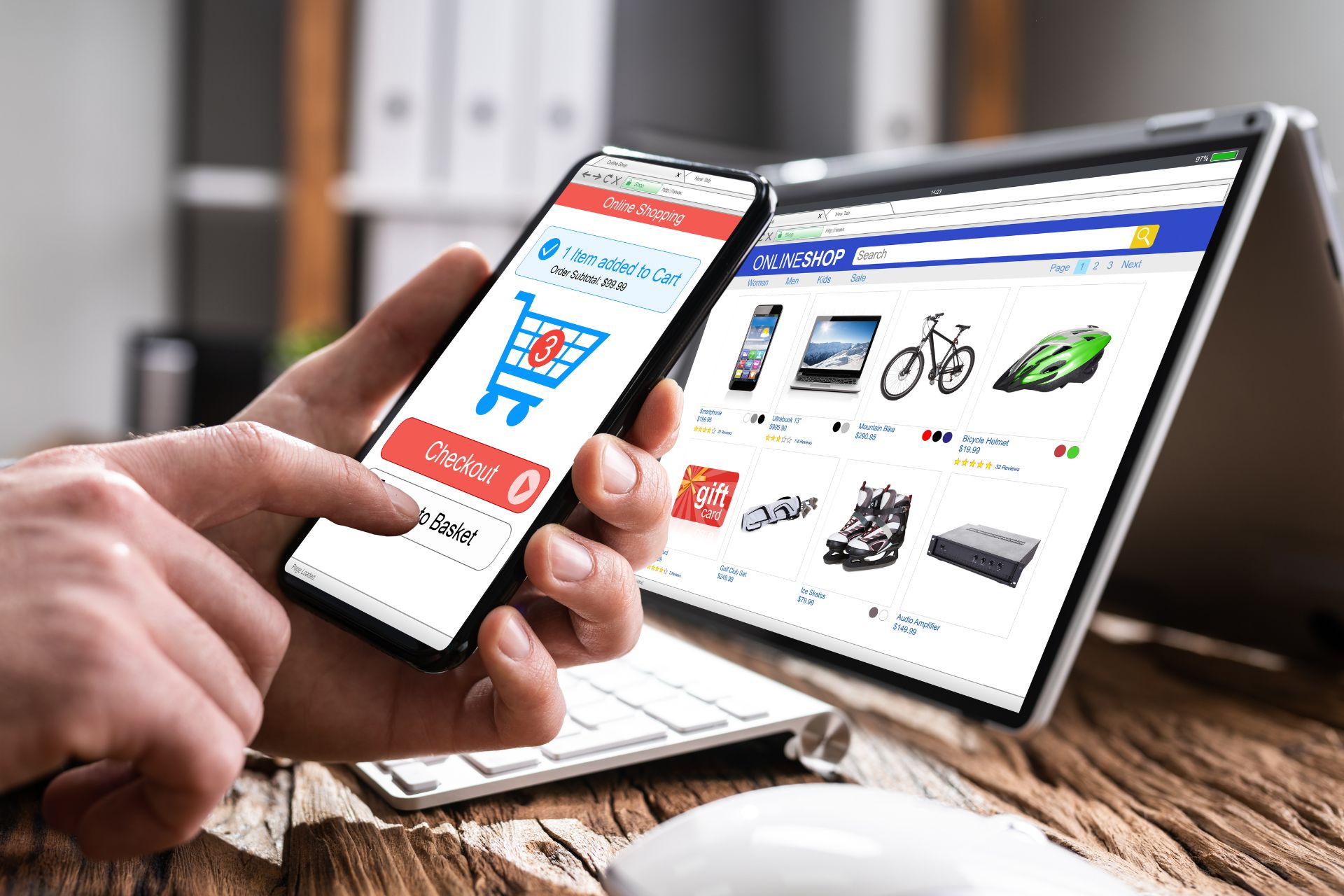
An ecommerce website is a website that allows you to buy and sell products or services online. It usually has features such as a product catalogue, shopping cart, checkout, payment gateway, order management, and customer service. An ecommerce website can also have other functionalities such as reviews, ratings, recommendations, loyalty programs, coupons, discounts, and more.

An ecommerce website can be built from scratch using coding languages such as HTML, CSS, JavaScript, PHP, and others. Alternatively, it can be created using an ecommerce platform or a website builder that provides ready-made templates, themes, plugins, and tools for building and managing an online store.

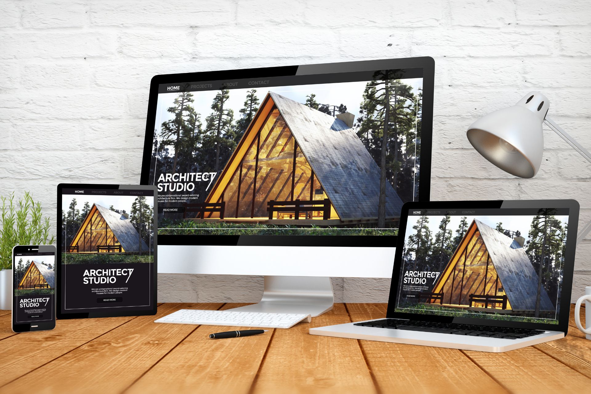
In order to be widely accessible, e-commerce websites need to have a responsive design, meaning that they should appear on devices such as desktops, tablets and mobile phones.

Types of ecommerce websites

There are many ways to classify ecommerce websites based on different criteria such as business model, revenue model, website type, and more. Here are some of the most common types of ecommerce websites:

Business model

The business model refers to who is selling to whom in an ecommerce transaction. There are four main types of business models:

  • Business-to-business (B2B): This is when a business sells products or services to another business. For example, a manufacturer selling raw materials to a wholesaler, or a software company selling licenses to a corporation.
  • Business-to-consumer (B2C): This is when a business sells products or services to individual consumers. For example, an online retailer selling clothes to customers, or a travel agency selling flights and hotels to travellers.
  • Consumer-to-consumer (C2C): This is when an individual consumer sells products or services to another individual consumer. For example, a person selling their used items on eBay or Craigslist, or a freelancer offering their skills on Fiverr or Upwork.
  • Consumer-to-business (C2B): This is when an individual consumer sells products or services to a business. For example, a blogger selling advertising space to a brand, or a photographer selling their photos to a stock image site.

Revenue model

The revenue model refers to how an ecommerce website makes money from its transactions. There are several types of revenue models:

  • Dropshipping: Acts as a middleman between the customer and the supplier. The website does not own or stock the products it sells; instead, it transfers the orders and shipment details to the supplier who fulfills them. The website earns a commission or markup from each sale.
  • Subscription: Charges customers a recurring fee to access its products or services. The fee can be charged monthly, quarterly, annually, or based on usage. The website provides value by offering convenience, savings, personalization, or exclusivity.
  • Membership: Charges customers a one-time or recurring fee to join its community or club. The website provides value by offering discounts, rewards, perks, access to premium content or features, or social interaction.
  • Advertising: Displays ads from third-party advertisers on its pages. The website earns money based on the number of impressions or clicks on the ads.
  • Affiliate: Promotes products or services from other websites or businesses and earns a commission for each referral or sale. The website provides value by offering relevant recommendations, reviews, comparisons, or guides.

Website type

The website type refers to the design and functionality of an ecommerce website. There are many types of ecommerce websites based on the products or services they offer, the industry they belong to, the audience they target, and more. Here are some examples of website types:

  • Single-product: Sells only one product or service. The website focuses on highlighting the features, benefits, and value propositions of the product or service and persuading customers to buy it.
  • Multi-product: Sells multiple products or services within one category or niche. The website organizes its products into subcategories and allows customers to browse, filter, sort, and compare them.
  • Marketplace: Acts as a platform that connects sellers and buyers of various products or services. The website facilitates the transactions between them and charges a fee for each sale.
  • Auction: Allows sellers and buyers to bid on products or services. The website sets the rules and conditions for the bidding process and charges a fee for each transaction.
  • Flash sale: Offers limited-time deals on products or services at discounted prices. The website creates urgency and scarcity by displaying countdown timers, stock levels, and social proof.

How to choose the best type of ecommerce website for your business

There is no one-size-fits-all answer to this question. The best type of ecommerce website for your business depends on various factors such as your products or services, your target market, your goals, your budget, your resources, and your preferences. However, here are some general tips to help you make an informed decision:

  • Research your competitors: Analyze the types of websites that your competitors use and identify their strengths and weaknesses. Learn from their best practices and avoid their mistakes.
  • Know your customers: Understand the needs, wants, preferences, and behaviours of your target customers. Find out what they are looking for, how they shop online, what they value, and what they expect from an ecommerce website.
  • Define your value proposition: Determine what makes your products or services unique, desirable, and valuable to your customers. Craft a clear and compelling message that communicates how you can solve their problems or fulfill their desires.
  • Choose a platform or builder: Decide whether you want to build your website from scratch or use an existing platform or builder. Compare the features, benefits, costs, and limitations of different options and choose the one that suits your needs and goals.
  • Test and optimize: Launch your website and monitor its performance. Collect feedback from your customers and analyze the data from your analytics tools. Identify the areas that need improvement and make changes accordingly.

Final Words

An ecommerce website is a powerful tool that can help you reach more customers, increase your sales, and grow your business. However, not all ecommerce websites are the same. You need to choose the right type of ecommerce website that matches your business model, revenue model, website type, and other factors.

If you need help with creating or improving your ecommerce website, you can contact TetrixDigital for professional website development services. TetrixDigital is a team of experts who can design and build a custom ecommerce website that meets your needs and exceeds your expectations. Whether you want a single-product, multi-product, marketplace, auction, flash sale, or any other type of ecommerce website, TetrixDigital can make it happen.

Contact TetrixDigital today and get a free quote for your ecommerce project.

The Benefits of a Responsive Website Design in 2023

The world of web design is constantly evolving and changing. With the rapid growth of mobile devices, tablets, and smart TVs, it is no longer enough to have a website that looks good on a desktop computer. Today, users expect websites to adapt to their screen size, orientation, and preferences, regardless of the device they are using. This is where responsive website design comes in.

What is Responsive Website Design?

It is an approach to web design that makes your website content adjust to the different screen and window sizes of a variety of devices. For example, your content might be separated into different columns on desktop screens, because they are wide enough to accommodate that layout. If you separate your content into multiple columns on a mobile device, it will be hard for users to read and interact with. Responsive design makes it possible to deliver multiple, separate layouts of your content and design to different devices depending on screen size.

Responsive web design and development are achieved by using a combination of fluid grids, flexible images, media queries, and relative sizing units. Fluid grids are elements that can resize and reposition themselves according to the available space. Flexible images are images that can scale up or down depending on the resolution and size of the screen. Media queries are rules that apply different styles based on the device characteristics, such as width, height, orientation, or pixel density. Relative sizing units are units that are based on the proportions of other elements or the viewport, such as percentages, ems, rems, vh, or vw.

Why Responsive Design Matters

First of all, it improves the user experience and satisfaction. Users can access your website from any device and enjoy a consistent and optimal viewing experience. They don’t have to zoom in or out, scroll horizontally, or deal with overlapping or distorted elements. They can easily navigate your website and find what they are looking for.

Secondly, it enhances your SEO performance and ranking. Google has been using mobile-friendliness as a ranking factor since 2015 and has recently switched to mobile-first indexing, which means that it crawls and indexes the mobile version of your website first. Having a responsive website means that you have one URL and one set of HTML code for all devices, which makes it easier for Google to crawl and index your website. It also reduces the risk of duplicate content issues and improves your page speed and loading time.

Thirdly, it increases your conversion rate and revenue. According to Statista, mobile devices accounted for 54.8% of global website traffic in 2021, and this number is expected to grow in 2023. This means that more and more users are browsing and shopping online using their smartphones or tablets. If your website is not responsive, you are losing potential customers who might bounce off your website or abandon their carts due to poor usability or functionality. On the other hand, if your website is responsive, you can capture more leads and sales from mobile users who are ready to buy.

How to Make Your Website Responsive

Making your website responsive might seem like a daunting task, but it doesn’t have to be. There are many tools and resources available to help you create a responsive website that looks great on any device. Here are some steps you can follow:

  • Start with a mobile-first approach. This means that you design your website for the smallest screen size first, and then add more features and elements as you move up to larger screens. This way, you can focus on the most important content and functionality for your users, and avoid unnecessary clutter or complexity.
  • Use a responsive framework or template. A framework is a set of pre-made code and components that you can use to build your website faster and easier. A template is a ready-made design that you can customize with your own content and style. There are many popular frameworks and templates available online, such as Bootstrap, Foundation, or WordPress. These tools can help you create a responsive website without having to write too much code from scratch.
  • Test your website on different devices and browsers. You can use tools like Chrome DevTools, Firefox Developer Tools, or Microsoft Edge DevTools to simulate how your website looks and behaves on different screen sizes and orientations. You can also use tools like BrowserStack or LambdaTest to test your website on real devices and browsers across various platforms and operating systems.
  • Optimize your images and videos for different breakpoints. Breakpoints are the points in screen size or orientation where your website changes its layout. You can use media queries to specify different image or video sources for different breakpoints so that you don’t load unnecessarily large or small files for different devices. You can also use tools like Cloudinary or ImageKit to automatically resize and optimize your images and videos for the best performance and quality.

Responsive Web Design Examples

To inspire you and show you what responsive website design can do, here are some examples of websites that have implemented responsive web design successfully:

  • Airbnb is a platform that connects travellers with hosts who offer unique accommodations around the world. Their website is responsive and adapts to different screen sizes and orientations, providing a seamless and intuitive user experience. The website features a simple and elegant design, with large and clear images, icons, and buttons. The website also uses a hamburger menu to save space and organize the navigation links on smaller screens.
  • Spotify is a streaming service that offers millions of songs, podcasts, and playlists for music lovers. Their website is responsive and adjusts to different devices and browsers, delivering a consistent and engaging user experience. The website features a dark and colourful design, with dynamic and interactive elements, such as animations, transitions, and hover effects. The website also uses a sticky header and footer to provide easy access to the main features and functions of the service.
  • TetrixDigital is a digital marketing agency that offers various online marketing solutions, such as website development, SEO, social media marketing, video marketing, and online ads. Their website is responsive and scales to different screen sizes and resolutions, showcasing their skills and expertise. The website features a modern and professional design, with crisp and clean images, icons, and fonts. The website also uses a call-to-action button to invite visitors to get a free quote for their services.

Some Final Words

Responsive website design is not a trend or an option anymore. It is a necessity and a standard for any website that wants to succeed in 2023. Responsive web design can help you improve your user experience, SEO performance, conversion rate, and revenue. It can also help you reach more customers and grow your business online.

If you want to create a responsive website that looks amazing on any device, you need a reliable and experienced partner who can help you achieve your goals. That’s why you should contact TetrixDigital today. TetrixDigital is a team of digital marketing experts who can help you create a sleek and responsive website that meets your needs and expectations. They can also help you with other online marketing services, such as SEO, social media marketing, video marketing, and online ads.

Don’t wait any longer. Get in touch with us today and get a free quote for your responsive website project. You won’t regret it!